
I’ll admit: Prior to Fall 2020, I was never an LMS person. I was trained in a program that lived and died under King Syllabus, where you’d give your students a 15-page syllabus and that would serve as the longform compendium of all of the course’s worldly knowledge. But with the move to virtual learning, the online space of our classrooms suddenly became much more important, taking on jobs that syllabi do not typically do: Discussion forums, digital assignment submission, etc.
When we were invited to make use of our class’s Moodle page as a course “hub,” I realized that it could be something I’ve always fantasized about: A dedicated classroom. Stuff on the walls! Classroom stations! Those awesome daily schedule pocket charts!
Using our Moodle page as an active hub, rather than as a link repository, helped give Moodle a “classroom” feel, carving out a digital space that my students could comfortably make real use of.
Moodle as Home Base
First of all, special thanks to the 2020 Teaching and Learning Workshop for the strong example it set in Moodle usage! Much of what I discuss below is an extension of what I saw modeled there.
I wanted our Moodle page to be a place that my students could access anything they could possibly need for our class, as expediently and hassle-freely as possible. Thinking as a student, for what reasons would I access the page, and how would I interact with it? This line of questioning is a basic version of what web developers/designers call “user stories,” which express a users’ goals in using a particular piece of software–from the perspective of the user, rather than the engineer.
With my user stories in mind, the landing page I came up with looks like this:
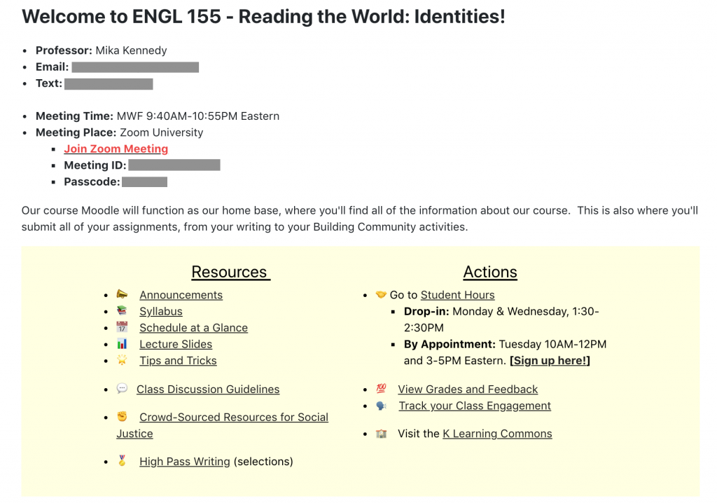
Any modern web designer would never speak to me again if they saw this, but look: This is pandemic-era remote learning, not the iPhone 12. It gets the job done.
You’ll notice it has the same bones as the first page of a syllabus, listing instructor contact info and all relevant course meeting info. It turned out this was quite important, though, because a decent number of my students used this Zoom link to log into class every single day (rather than logging in directly through the Zoom app, as I do). They were essentially walking into the Moodle “classroom” every morning.
A few additional suggestions for the landing page:
- State how the space will be used: This is a general principle of inclusive pedagogy, but I think it’s especially important in digital space, where the different ways we inhabit and interpret our surroundings are augmented. In a world where a Moodle page could mean or do any number of things, it’s helpful to be as transparent as possible about how it will be used in this particular context.
- Divide links into Resources and Actions: I know, I mentioned not making Moodle a link repository and then immediately offered a screenshot of a bunch of links. But thinking about how to organize those links can help shape a student’s Moodle experience. In my case, I wanted it to be clear which links included passive reference material, and which links were the ones they’d want to use if there was some particular action they wanted to carry out.
Moodle as Weekly Planner
I also used Moodle as a “weekly planner” for the course. While the syllabus listed the reading/major due date schedule for the entire quarter, I reproduced this on Moodle week-by-week, adding in the links to that week’s Discussion Forums and submission portals, etc.
I chose to display these in reverse chronological order, so the most relevant week would always be easiest to access; and all on one page, in order to limit the number of clicks required to access information. (One-page websites have been all the rage for a few years now, which is an abrupt 180 from the thousands of micro-pages that distinguished web design in the early 2000s. The shift has been largely influenced by smartphone and tablet usage, where scrolling is easier than clicking, and the fact that Internet providers are able to smoothly load a lot more content than they could before.)
Here’s what that looked like:
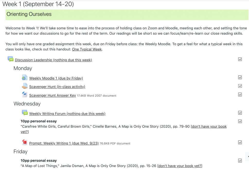
- Mutual Assured Organization: If you’re not personally a big fan of Moodle or LMS usage in general, making a schedule like this every week might seem like an inane way to spend your time, especially since you’ve already done it once for your syllabus. And your mileage may certainly vary! But I got a lot out of this, because I’d typically put up the Weekly Schedule on a Friday afternoon, and I would use it as my own time to frame the week for myself, actively reorient myself to my syllabus, and make sure I was on top of my work for the class as well, re: prompts and deadlines and any number of things. I used this organizer just as much as–if not more than–my students did, so it felt like part of the process, rather than extraneous time spent Moodling.
- Redundancy: “Per the syllabus…” indeed! Yes, this is all in the syllabus! Redundancy is generally frowned upon when designing user interfaces, because redundancies the user can see introduce needless complexities and messiness. But I think there’s still value in putting information in multiple places. Per inclusive pedagogy, we’re not all using these digital spaces in the same way, so the most “natural” path won’t be the same for everyone. Offering information multiple times, in multiple modalities, gives students the best chance of finding the path that works for them.
- Metadata: You may have noticed that the readings are introduced with a bolded heading that notes their length and genre. I was using this metadata to design my syllabus, and ending up leaving it in for my students as well, as another way of trying to distinguish the syllabus/Moodle from a straight link repository. All links look equal in digital space, absent the heft of a printed handout or the visual differences between a blog post and an academic article–distinctions that can help students get a sense of what they’re in for, how the should be reading, and how long it will take. I used the additional short description to give the links a “shape,” so students would know before 2AM when they open all of them in tabs whether they should have set aside time to read a 35-page academic article, or a 2-page blog post.
- Personalization: I also used the Moodle version of our weekly schedule to present examples of student work and collect resources people brought up in class. With students’ permission, I included links to asynchronous work my students had completed whenever they wished to share it, and added links to documentaries, articles, Twitter threads, etc. that people brought up in class–basically, the web version of putting student work up on the walls. Clearly labeled and not overwhelmingly frequent, I think this added a more interactive, human touch to the Weekly Schedule without cluttering out assigned readings/assignment submission links. It was a way to highlight student contributions without hiding them deep in the underground bunker that old/non-mandatory Discussion Forums can sometimes become.
**Deep Cut: If you enjoy thinking about design and are positively enthralled by the idea of getting deeper into the weeds–to be perfectly honest, far, far, far, far, far, deeper than anyone might need to go for our purposes–the futur is an LA-based design company that has a series of web videos that break down the process and considerations that go into building websites that work. While they specialize in corporate/consumer-facing work, I find the basic tenets easily translatable. Plus, the client example they use is a fancy rustic bed and breakfast in British Columbia, which is a lovely bit of vicarious travel during stay-at-home.
Hi Dr. Kennedy,
Wanted to say thanks for this great post!! These are some excellent ideas!
At the risk of sounding like a complete luddite who isn’t hip to the Moodles, or explaining something that others have already figured out, or letting the details of implementation obscure the larger message of purposeful design with student use in mind, I wanted to offer two things for those of you who read this post and are not Moodle gurus (like me) but want to try out Mika’s design advice/elements and are confused about doing so when you surf over to your Moodle page. [Ultimately, I hope to save you time if you want to try some of the above out.]
1) The Moodle default text editor (Atto) makes text editing with background colors, as Mika does in her post above, difficult if not impossible. (Note: difficult using direct HTML coding, impossible if you do not use HTML, as far as I can tell.)
Anyone who may want to try adding background colors to Moodle’s textual elements…your lives will be made infinitely easier if you change your default text editor to TinyMCE. To do this, go to your User Preferences (upper right – drop down menu under your use photo) and click “Preferences.” to arrive at the preferences menu. Under the Preferences and User Account menu, click on Editor preferences and then use the dropdown menu to highlight “TinyMCE HTML editor” and click the “Save Changes” Box at the bottom of the page. This should allow you to edit text with TinyMCE – the expanded editor menu of TinyMCE allows for quick background text color change (do an internet search for “TinyMCE Moodle editor” to see how the editor works in Moodle.
2) Moodle has stock emojis, and Mika uses some non-stock ones (e.g. 📣- maybe this will work in the comment box, maybe not, but it’s supposed to be a bullhorn emoji if it doesn’t come through : ) in the above post. You can search for these non-stock emojis (there are myriad sites with them on the internets). After you find an emoji you like, you can easily copy-paste into the text editor. They should appear as they do online in the Moodle text box. For example, I’ve even found a virus 🦠…